 f08bcb2a2c
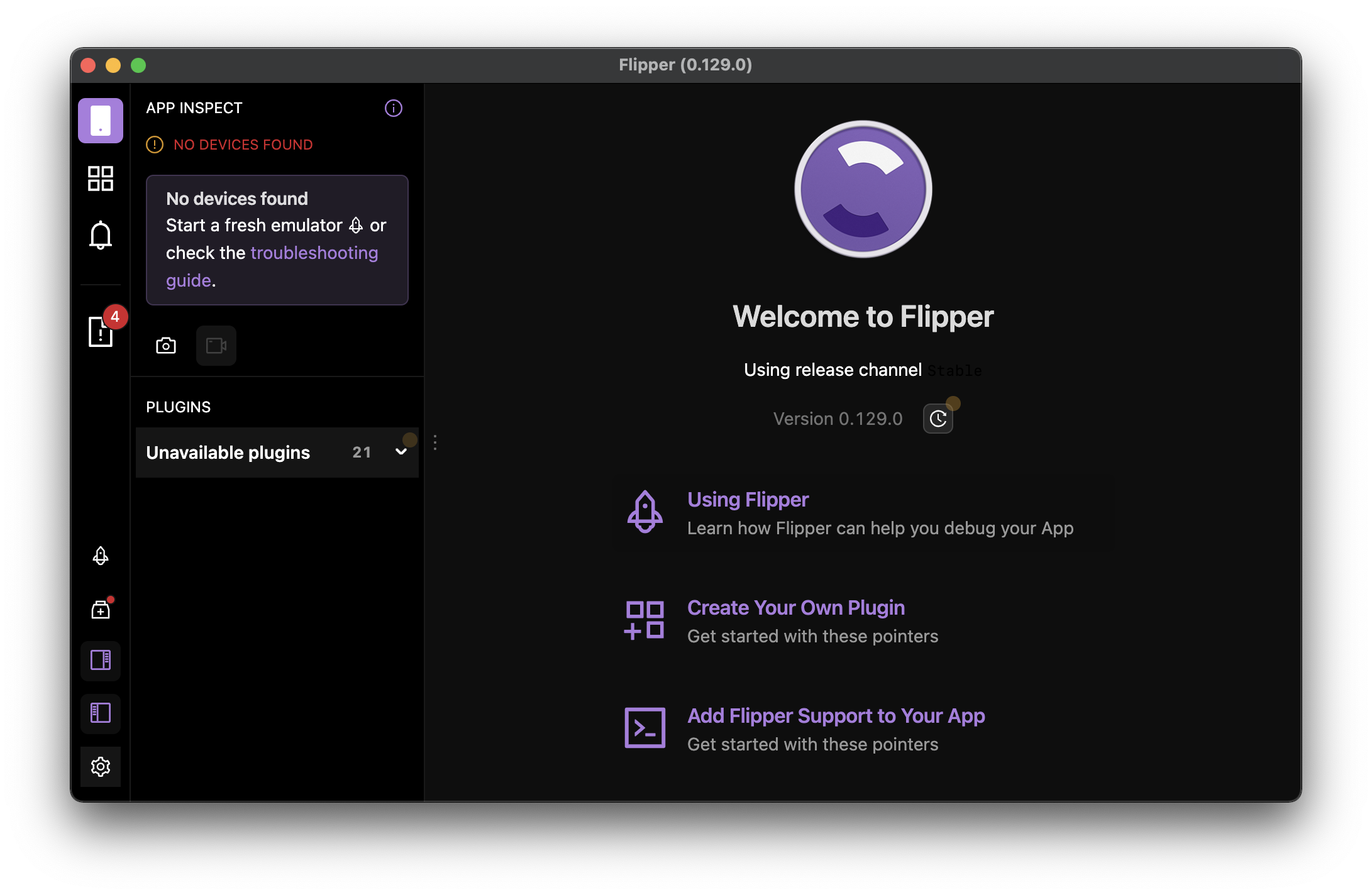
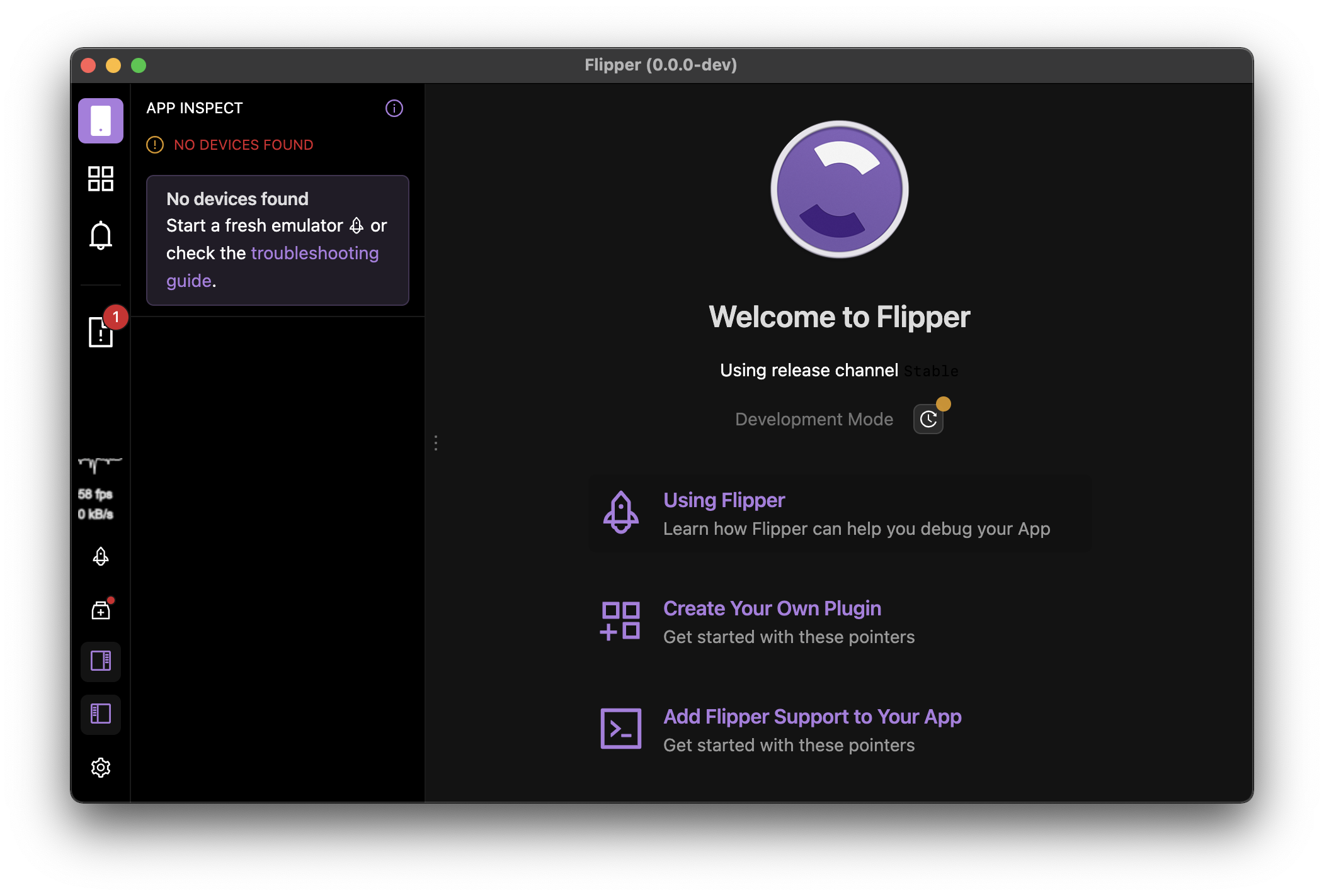
Summary:
Currently the design of `LeftRail` varies a bit between light and dark modes. Additionally washed background color is hard to differentiate from the main background color in comparison to the light theme (See `LeftRail` sidebars toggle buttons background for example). This lead to few contrast related issues, for example the hover effect on the WelcomeScreen elements is not visible in dark mode.

The PR tweaks the dark mode theme colors and fixes the unnecessary background of Settings icon in dark mode.

I have also spotted that icon `hover` effect is not working when icon has a badge (pure dot or count), I might have an idea how to fix this and I will push another PR for that. 🙂

## Changelog

* tweak dark mode theme colors, improve LeftRail UI

Pull Request resolved: https://github.com/facebook/flipper/pull/3335

Test Plan:
The change has been testes by running the desktop Flipper app locally from source.

## Preview (before & after)

<img width="390" alt="Screenshot 2022-01-24 at 13 37 20" align="left" src="https://user-images.githubusercontent.com/719641/150784627-36e222a8-e53e-4409-ab72-783d4a594f8e.png">
<img width="390" alt="Screenshot 2022-01-24 at 13 46 08" src="https://user-images.githubusercontent.com/719641/150785438-bb496adf-83ab-4b1c-928d-07f4b0098f1a.png">

Reviewed By: antonk52

Differential Revision: D33741513

Pulled By: lblasa

fbshipit-source-id: ef187db0725ac2b04c09b7f06823e713b50be88f
58 lines
1.9 KiB
Plaintext
58 lines
1.9 KiB
Plaintext
/**
|
|
* Copyright (c) Meta Platforms, Inc. and affiliates.
|
|
*
|
|
* This source code is licensed under the MIT license found in the
|
|
* LICENSE file in the root directory of this source tree.
|
|
*
|
|
*/
|
|
@import '../node_modules/antd/lib/style/themes/dark.less';
|
|
@import './base.less';
|
|
|
|
// Based on: https://www.figma.com/file/4e6BMdm2SuZ1L7FSuOPQVC/Flipper?node-id=620%3A84614
|
|
|
|
// Link Text & Icon
|
|
@primary-color: @purple-8;
|
|
// Success
|
|
@success-color: @green-7;
|
|
// Negative
|
|
@error-color: @red-6;
|
|
// Warning
|
|
@warning-color: @gold-6;
|
|
// Primary Text & Icon
|
|
@text-color-primary: @white;
|
|
// Secondary Text & Icon
|
|
@text-color-secondary: #999; // white 60%
|
|
// Placeholder Text & Icon
|
|
@text-color-placeholder: #737373; // white 45%
|
|
// Disabled & Icon
|
|
@disabled-color: #404040; // white 25%
|
|
// Background - default
|
|
@background-default: @black;
|
|
// Background - Wash
|
|
@background-wash: #121212;
|
|
// Backgroud - default button
|
|
@button-default-background: rgba(255, 255, 255, 0.15); // white 15%
|
|
// Background - transparent hover
|
|
@button-transparent-hover: rgba(255, 255, 255, 0.1); // white 10%
|
|
|
|
// The following variables are not yet defined at this moment,
|
|
// as they have / need no mapping to ANT (?)
|
|
// @background-wash2: fade(@white, 10%)
|
|
// @button-primary-background: @purple6;
|
|
// @button-primary-background-hover: @purple7;
|
|
// @button-default=backgorund-hover: @fade(@white, 15%)
|
|
// @button-default-background-disabled: @fade(@white, 10%)
|
|
// @button-background-active: @fade(@white, 8%)
|
|
|
|
// Divider color
|
|
@divider-color: #1c1c1c;
|
|
|
|
// Semantic colors: Diff
|
|
@diff-added-background: @lime-2;
|
|
@diff-removed-background: @volcano-2;
|
|
|
|
::-webkit-scrollbar { width: 8px; height: 8px; }
|
|
::-webkit-scrollbar-track-piece { background-color: transparent; }
|
|
::-webkit-scrollbar-thumb { background-color: rgba(255, 255, 255, 0.5); border-radius: 3px;}
|
|
::-webkit-scrollbar-thumb:hover {background-color: rgba(255, 255, 255, 0.7);}
|