 903476bdad
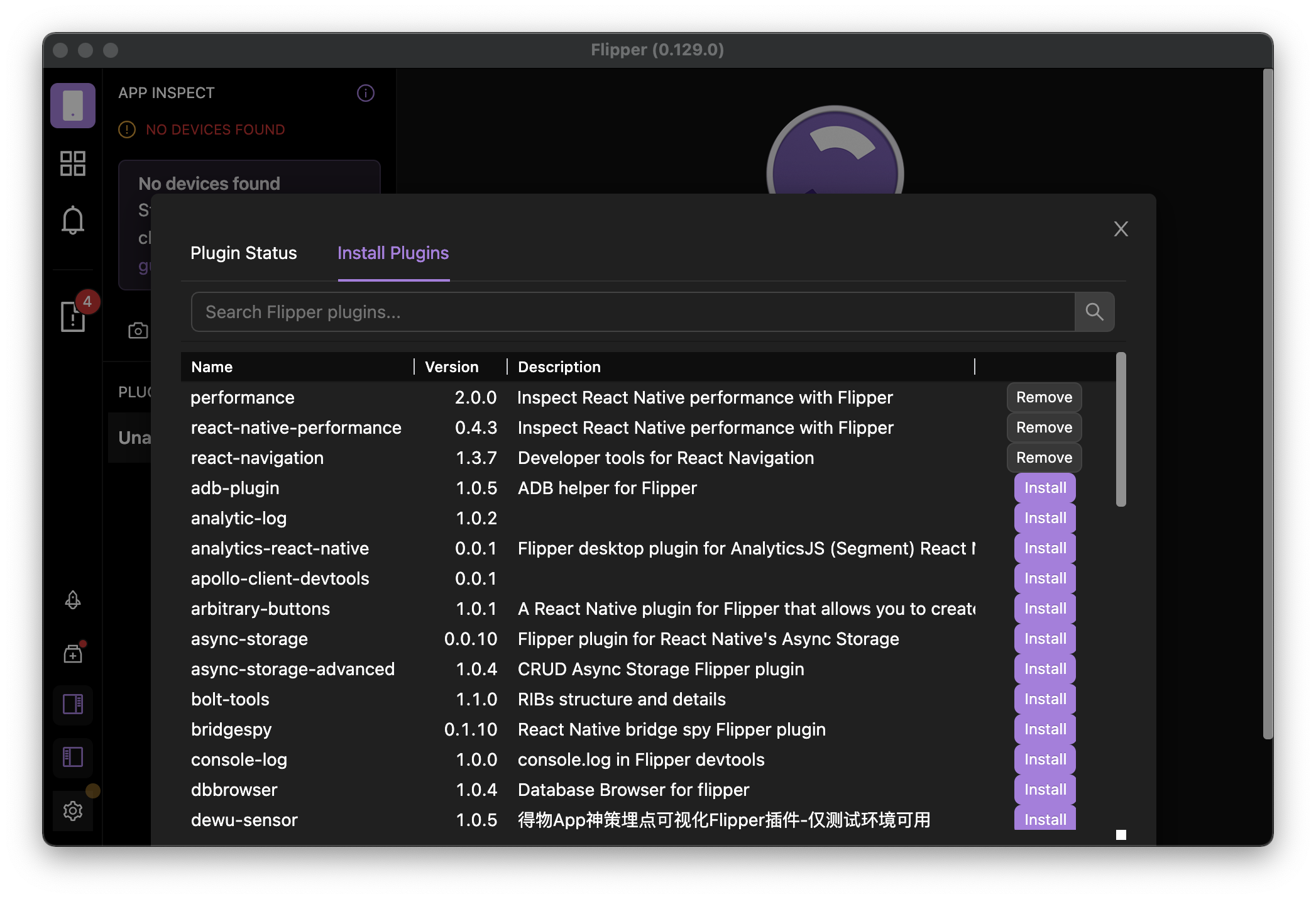
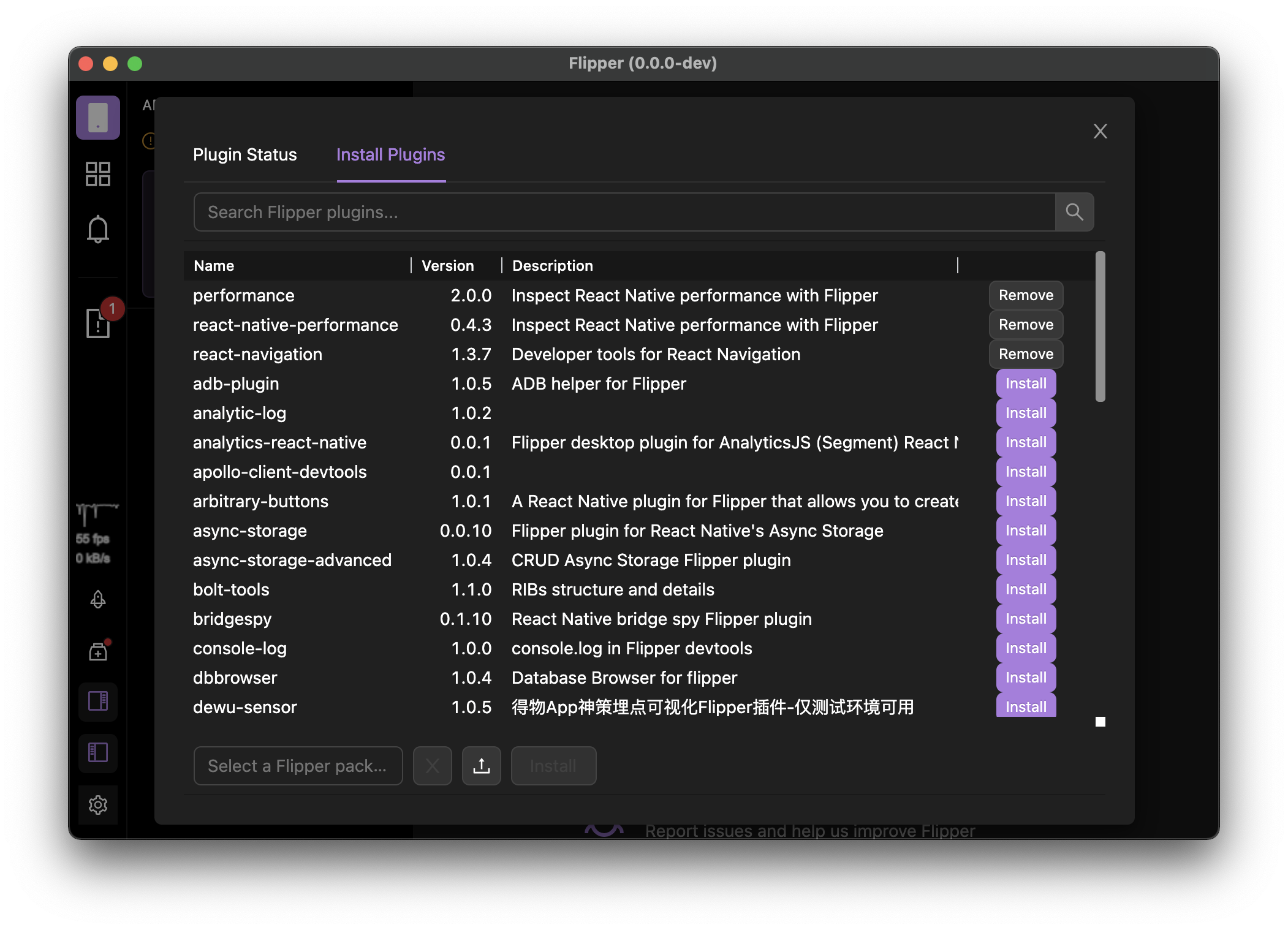
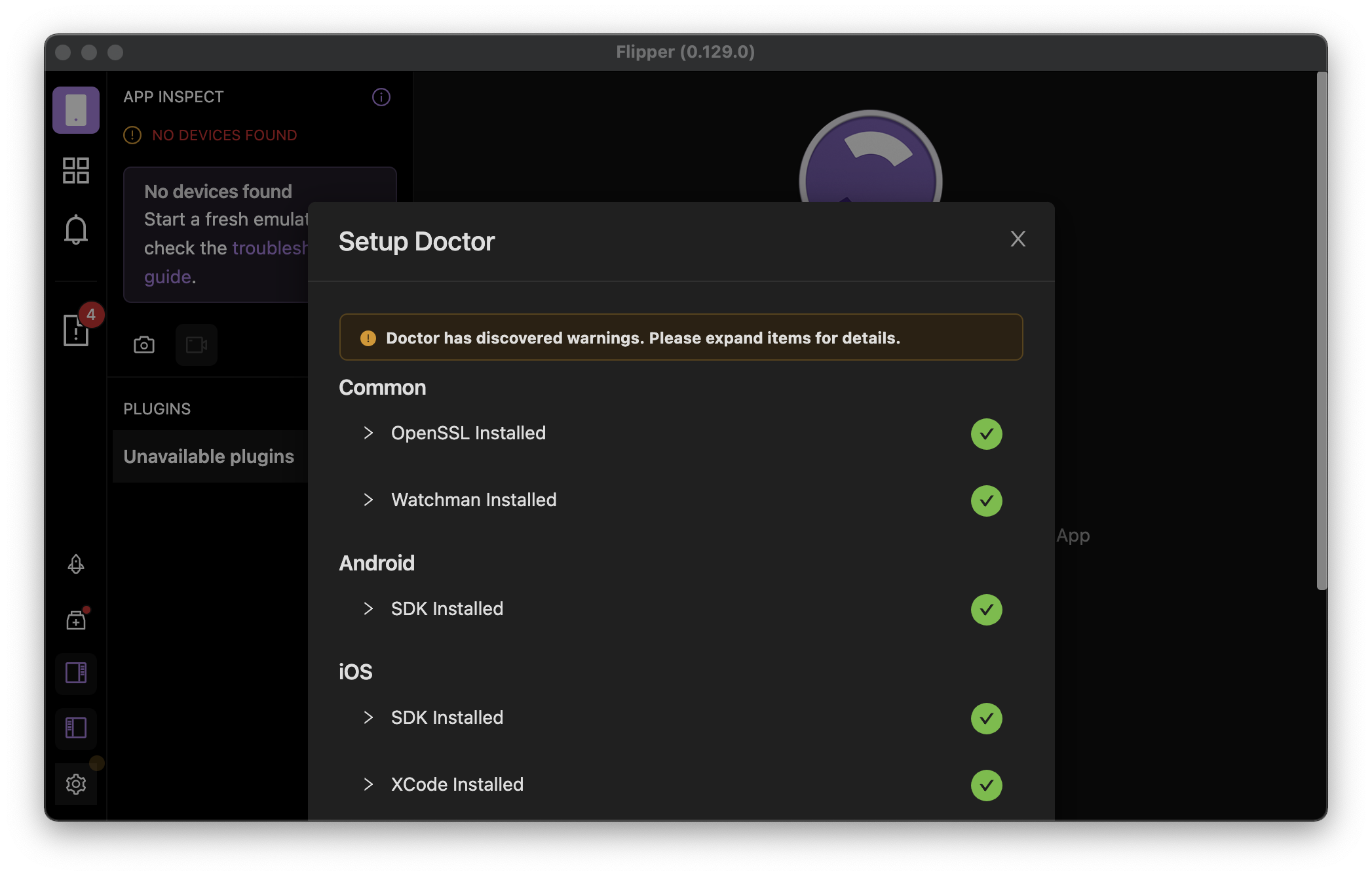
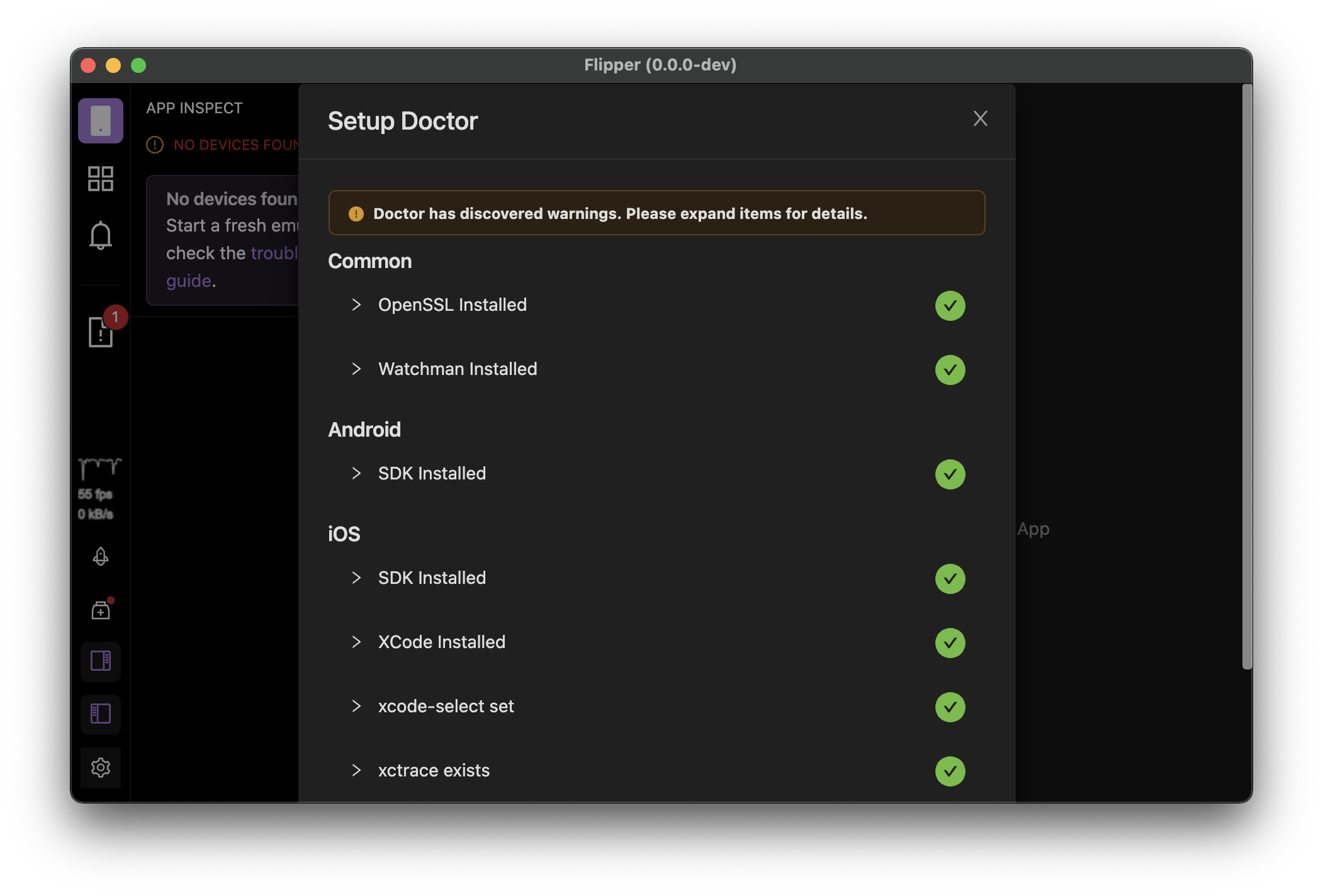
Summary:
Currently all of the modals are displayed using default positioning, which works fine for small modals and large app windows, but it cause small UI/UX issues (double scroll bars) when app window is quite small.

Adding [`centered` prop](https://ant.design/components/modal/#API) for variable height modals improves this situation a bit, but it also changes a bit the modal position when using maximised window, but I think this is bearable looking at improvements gained when window size is reduced.

## Changelog

* use `centered` prop for variable height modals to improve UI in small app window

Pull Request resolved: https://github.com/facebook/flipper/pull/3334

Test Plan:
The change has been testes by running the desktop Flipper app locally from source.

## Preview (before & after)

#### Small App Window
<img width="390" alt="Screenshot 2022-01-24 at 11 58 40" align="left" src="https://user-images.githubusercontent.com/719641/150771900-cb25d110-82c7-4ba9-8ee5-07a093c4f702.png">
<img width="390" alt="Screenshot 2022-01-24 at 11 58 37" src="https://user-images.githubusercontent.com/719641/150771911-c81592ac-1eba-4112-86ad-9549e6248239.png">

<img width="390" alt="Screenshot 2022-01-24 at 12 00 13" align="left" src="https://user-images.githubusercontent.com/719641/150772045-de37c432-4381-4207-8476-5f142dfb6fa5.png">
<img width="390" alt="Screenshot 2022-01-24 at 12 00 10" src="https://user-images.githubusercontent.com/719641/150772057-574cf6cd-6f1a-4ca2-a343-b8fd6342eddb.png">

#### Maximised App Window
<img width="390" alt="Screenshot 2022-01-24 at 12 12 12" align="left" src="https://user-images.githubusercontent.com/719641/150772777-8ac3cb59-3b41-4dcb-9554-137e95857af8.png">
<img width="390" alt="Screenshot 2022-01-24 at 12 12 29" src="https://user-images.githubusercontent.com/719641/150772758-ca9f8c20-d6d0-412d-9067-7e756da0b56c.png">

Reviewed By: mweststrate

Differential Revision: D33741484

Pulled By: lblasa

fbshipit-source-id: 0c3ca883d051cf4fcce9f9c1b6688974b66fd0d8
231 lines
6.2 KiB
TypeScript
231 lines
6.2 KiB
TypeScript
/**
|
|
* Copyright (c) Meta Platforms, Inc. and affiliates.
|
|
*
|
|
* This source code is licensed under the MIT license found in the
|
|
* LICENSE file in the root directory of this source tree.
|
|
*
|
|
* @format
|
|
*/
|
|
|
|
import React, {cloneElement} from 'react';
|
|
import {styled} from '../ui';
|
|
import {Modal, Button, Image, Checkbox, Space, Typography, Tooltip} from 'antd';
|
|
import {
|
|
RocketOutlined,
|
|
AppstoreAddOutlined,
|
|
CodeOutlined,
|
|
BugOutlined,
|
|
HistoryOutlined,
|
|
} from '@ant-design/icons';
|
|
import {Layout, NUX, theme, Tracked, TrackingScope} from 'flipper-plugin';
|
|
|
|
const {Text, Title} = Typography;
|
|
|
|
import constants from '../fb-stubs/constants';
|
|
import config from '../fb-stubs/config';
|
|
import isProduction from '../utils/isProduction';
|
|
import {getAppVersion} from '../utils/info';
|
|
import {getFlipperLib} from 'flipper-plugin';
|
|
import {ReleaseChannel} from 'flipper-common';
|
|
import {showChangelog} from '../chrome/ChangelogSheet';
|
|
|
|
const RowContainer = styled(Layout.Horizontal)({
|
|
alignItems: 'flex-start',
|
|
padding: `${theme.space.small}px`,
|
|
cursor: 'pointer',
|
|
'&:hover, &:focus, &:active': {
|
|
backgroundColor: theme.backgroundTransparentHover,
|
|
borderRadius: theme.borderRadius,
|
|
textDecoration: 'none',
|
|
},
|
|
});
|
|
|
|
function Row(props: {
|
|
icon: React.ReactElement;
|
|
title: string;
|
|
subtitle: string;
|
|
onClick?: () => void;
|
|
}) {
|
|
return (
|
|
<Tracked action={props.title}>
|
|
<RowContainer onClick={props.onClick}>
|
|
<Space size="middle">
|
|
{cloneElement(props.icon, {
|
|
style: {fontSize: 36, color: theme.primaryColor},
|
|
})}
|
|
<Layout.Container>
|
|
<Title level={3} style={{color: theme.primaryColor}}>
|
|
{props.title}
|
|
</Title>
|
|
<Text type="secondary">{props.subtitle}</Text>
|
|
</Layout.Container>
|
|
</Space>
|
|
</RowContainer>
|
|
</Tracked>
|
|
);
|
|
}
|
|
|
|
const FooterContainer = styled(Layout.Horizontal)({
|
|
justifyContent: 'space-between',
|
|
alignItems: 'center',
|
|
});
|
|
|
|
function WelcomeFooter({
|
|
onClose,
|
|
checked,
|
|
onCheck,
|
|
}: {
|
|
onClose: () => void;
|
|
checked: boolean;
|
|
onCheck: (value: boolean) => void;
|
|
}) {
|
|
return (
|
|
<FooterContainer>
|
|
<Checkbox checked={checked} onChange={(e) => onCheck(e.target.checked)}>
|
|
<Text style={{fontSize: theme.fontSize.small}}>
|
|
Show this when app opens (or use ? icon on left)
|
|
</Text>
|
|
</Checkbox>
|
|
<Button type="primary" onClick={onClose}>
|
|
Close
|
|
</Button>
|
|
</FooterContainer>
|
|
);
|
|
}
|
|
|
|
const openExternal = (url: string) => () => getFlipperLib().openLink(url);
|
|
|
|
export default function WelcomeScreen({
|
|
visible,
|
|
onClose,
|
|
showAtStartup,
|
|
onCheck,
|
|
}: {
|
|
visible: boolean;
|
|
onClose: () => void;
|
|
showAtStartup: boolean;
|
|
onCheck: (value: boolean) => void;
|
|
}) {
|
|
return (
|
|
<Modal
|
|
centered
|
|
closable={false}
|
|
visible={visible}
|
|
footer={
|
|
<WelcomeFooter
|
|
onClose={onClose}
|
|
checked={showAtStartup}
|
|
onCheck={onCheck}
|
|
/>
|
|
}
|
|
onCancel={onClose}>
|
|
<WelcomeScreenContent />
|
|
</Modal>
|
|
);
|
|
}
|
|
|
|
export function WelcomeScreenStaticView() {
|
|
return (
|
|
<Layout.Container
|
|
center
|
|
style={{
|
|
justifyContent: 'center',
|
|
overflow: 'hidden',
|
|
}}
|
|
pad
|
|
grow>
|
|
<Layout.Container width={400} center>
|
|
<WelcomeScreenContent />
|
|
</Layout.Container>
|
|
</Layout.Container>
|
|
);
|
|
}
|
|
|
|
function WelcomeScreenContent() {
|
|
const isInsidersChannel =
|
|
config.getReleaseChannel() === ReleaseChannel.INSIDERS;
|
|
|
|
return (
|
|
<TrackingScope scope="welcomescreen">
|
|
<Space
|
|
direction="vertical"
|
|
size="middle"
|
|
style={{width: '100%', padding: '0 32px 32px', alignItems: 'center'}}>
|
|
<Image
|
|
style={{
|
|
filter: isInsidersChannel ? 'hue-rotate(230deg)' : 'none',
|
|
}}
|
|
width={125}
|
|
height={125}
|
|
src="./icon.png"
|
|
preview={false}
|
|
/>
|
|
<Title level={1}>Welcome to Flipper</Title>
|
|
<Text>
|
|
Using release channel{' '}
|
|
<code
|
|
style={{
|
|
margin: 0,
|
|
padding: 0,
|
|
border: 'none',
|
|
background: 'none',
|
|
color: isInsidersChannel
|
|
? 'rgb(62, 124, 66)'
|
|
: theme.textColorSecondary,
|
|
textTransform: 'capitalize',
|
|
fontSize: theme.fontSize.default,
|
|
fontWeight: isInsidersChannel ? theme.bold : 'normal',
|
|
}}>
|
|
{config.getReleaseChannel()}
|
|
</code>
|
|
</Text>
|
|
<Space direction="horizontal" size="middle">
|
|
<Text style={{color: theme.textColorPlaceholder}}>
|
|
{isProduction() ? `Version ${getAppVersion()}` : 'Development Mode'}
|
|
</Text>
|
|
<Tooltip title="Changelog" placement="bottom">
|
|
<NUX title="See Flipper changelog" placement="top">
|
|
<Button
|
|
size="small"
|
|
icon={<HistoryOutlined />}
|
|
title="Changelog"
|
|
onClick={() => {
|
|
showChangelog(false);
|
|
}}
|
|
/>
|
|
</NUX>
|
|
</Tooltip>
|
|
</Space>
|
|
</Space>
|
|
<Space direction="vertical" size="large" style={{width: '100%'}}>
|
|
<Row
|
|
icon={<RocketOutlined />}
|
|
title="Using Flipper"
|
|
subtitle="Learn how Flipper can help you debug your App"
|
|
onClick={openExternal('https://fbflipper.com/docs/features/index')}
|
|
/>
|
|
<Row
|
|
icon={<AppstoreAddOutlined />}
|
|
title="Create Your Own Plugin"
|
|
subtitle="Get started with these pointers"
|
|
onClick={openExternal('https://fbflipper.com/docs/tutorial/intro')}
|
|
/>
|
|
<Row
|
|
icon={<CodeOutlined />}
|
|
title="Add Flipper Support to Your App"
|
|
subtitle="Get started with these pointers"
|
|
onClick={openExternal(
|
|
'https://fbflipper.com/docs/getting-started/index',
|
|
)}
|
|
/>
|
|
<Row
|
|
icon={<BugOutlined />}
|
|
title="Contributing and Feedback"
|
|
subtitle="Report issues and help us improve Flipper"
|
|
onClick={openExternal(constants.FEEDBACK_GROUP_LINK)}
|
|
/>
|
|
</Space>
|
|
</TrackingScope>
|
|
);
|
|
}
|