 c4577bfee2
Summary: Bug fix. Currenty Flipper provides incorrect red and green diff colors in Dark theme, this PR fixes the issue. Light theme colors are the same. Closes https://github.com/facebook/flipper/issues/3011 ## Changelog Color theme fix: make diff background colors be defined in theme LESS files Pull Request resolved: https://github.com/facebook/flipper/pull/3065 Test Plan: I used [redux-debugger](https://github.com/jk-gan/flipper-plugin-redux-debugger) plugin to test this as this is what I actually use for debugging Redux in React Native projects with Flipper. Here's a [React Native app](https://github.com/3rdp/flipper-redux-debugger-app) that I put together for testing purposes. Light theme: 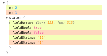 Dark theme: 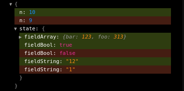 Reviewed By: mweststrate Differential Revision: D32529276 Pulled By: passy fbshipit-source-id: 3d11edaf1112444bb106521b6b30db4a4c2b8202
53 lines
1.6 KiB
Plaintext
53 lines
1.6 KiB
Plaintext
/**
|
|
* Copyright (c) Facebook, Inc. and its affiliates.
|
|
*
|
|
* This source code is licensed under the MIT license found in the
|
|
* LICENSE file in the root directory of this source tree.
|
|
*
|
|
*/
|
|
@import '../node_modules/antd/lib/style/themes/default.less';
|
|
@import './base.less';
|
|
|
|
// Based on: https://www.figma.com/file/4e6BMdm2SuZ1L7FSuOPQVC/Flipper?node-id=620%3A84614
|
|
|
|
// Link Text & Icon
|
|
@primary-color: @purple-6;
|
|
// Success
|
|
@success-color: @green-7;
|
|
// Negative
|
|
@error-color: @red-6;
|
|
// Warning
|
|
@warning-color: @gold-6;
|
|
// Primary Text & Icon
|
|
@text-color-primary: @black;
|
|
// Secondary Text & Icon
|
|
@text-color-secondary: #666; // black 60%
|
|
// Placeholder Text & Icon
|
|
@text-color-placeholder: #8c8c8c; // black 45%
|
|
// Disabled & Icon
|
|
@disabled-color: #bfbfbf; // black 25%
|
|
// Background - default
|
|
@background-default: @white;
|
|
// Background - Wash
|
|
@background-wash: #f2f2f2; // black 5%
|
|
// Backgroud - default button
|
|
@button-default-background: rgba(0, 0, 0, 0.1); // black 10%
|
|
// Background - transparent hover
|
|
@background-transparent-hover: rgba(0, 0, 0, 0.1); // black 10%
|
|
|
|
// The following variables are not yet defined at this moment,
|
|
// as they have / need no mapping to ANT (?)
|
|
// @background-wash2: fade(@black, 10%)
|
|
// @button-primary-background: @purple6;
|
|
// @button-primary-background-hover: @purple7;
|
|
// @button-default=backgorund-hover: @fade(@black, 15%)
|
|
// @button-default-background-disabled: @fade(@black, 10%)
|
|
// @button-background-active: @fade(@black, 8%)
|
|
|
|
// Divider color
|
|
@divider-color: #ececec; // black 10%
|
|
|
|
// Semantic colors: Diff
|
|
@diff-added-background: @lime-2;
|
|
@diff-removed-background: @volcano-2;
|