 c4577bfee2
Summary: Bug fix. Currenty Flipper provides incorrect red and green diff colors in Dark theme, this PR fixes the issue. Light theme colors are the same. Closes https://github.com/facebook/flipper/issues/3011 ## Changelog Color theme fix: make diff background colors be defined in theme LESS files Pull Request resolved: https://github.com/facebook/flipper/pull/3065 Test Plan: I used [redux-debugger](https://github.com/jk-gan/flipper-plugin-redux-debugger) plugin to test this as this is what I actually use for debugging Redux in React Native projects with Flipper. Here's a [React Native app](https://github.com/3rdp/flipper-redux-debugger-app) that I put together for testing purposes. Light theme: 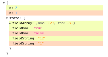 Dark theme: 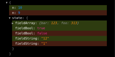 Reviewed By: mweststrate Differential Revision: D32529276 Pulled By: passy fbshipit-source-id: 3d11edaf1112444bb106521b6b30db4a4c2b8202
62 lines
2.2 KiB
Plaintext
62 lines
2.2 KiB
Plaintext
/**
|
|
* Copyright (c) Facebook, Inc. and its affiliates.
|
|
*
|
|
* This source code is licensed under the MIT license found in the
|
|
* LICENSE file in the root directory of this source tree.
|
|
*
|
|
*/
|
|
@import '../node_modules/antd/dist/antd.less';
|
|
@import './typography.less';
|
|
/* Based on: https://www.figma.com/file/4e6BMdm2SuZ1L7FSuOPQVC/Flipper?node-id=620%3A84636 */
|
|
@background-transparent-hover: rgba(0, 0, 0, 0.1);
|
|
|
|
@border-radius-base: 6px;
|
|
|
|
@font-family: -apple-system, BlinkMacSystemFont, 'Segoe UI', Roboto,
|
|
'Helvetica Neue', Arial, 'Noto Sans', sans-serif, 'Apple Color Emoji',
|
|
'Segoe UI Emoji', 'Segoe UI Symbol', 'Noto Color Emoji';
|
|
@code-family: 'SFMono-Regular', Consolas, 'Liberation Mono', Menlo, Courier,
|
|
monospace;
|
|
|
|
/**
|
|
This section adds specific paddings to ANT component to match design
|
|
*/
|
|
|
|
/**
|
|
This section maps theme base colors as defined in light/dark.less to ANT variables
|
|
(as far as they aren't already)
|
|
*/
|
|
@highlight-color: @error-color;
|
|
@badge-color: @error-color;
|
|
@text-color: @text-color-primary;
|
|
@input-placeholder-color: @text-color-placeholder;
|
|
@body-background: @background-default; // Background color for `<body>`
|
|
@normal-color: @background-wash;
|
|
@tooltip-color: @background-default;
|
|
@tooltip-bg: @text-color-primary;
|
|
@btn-default-bg: @button-default-background;
|
|
|
|
/**
|
|
This section maps theme colors to CSS variables so that they can be
|
|
used in styled components, see theme.tsx
|
|
*/
|
|
|
|
:root {
|
|
--flipper-primary-color: @primary-color;
|
|
--flipper-success-color: @success-color;
|
|
--flipper-error-color: @error-color;
|
|
--flipper-warning-color: @warning-color;
|
|
--flipper-text-color-primary: @text-color-primary;
|
|
--flipper-text-color-secondary: @text-color-secondary;
|
|
--flipper-text-color-placeholder: @text-color-placeholder;
|
|
--flipper-disabled-color: @disabled-color;
|
|
--flipper-background-default: @background-default;
|
|
--flipper-background-wash: @background-wash;
|
|
--flipper-button-default-background: @button-default-background;
|
|
--flipper-background-transparent-hover: @background-transparent-hover;
|
|
--flipper-divider-color: @divider-color;
|
|
--flipper-diff-added-background: @diff-added-background;
|
|
--flipper-diff-removed-background: @diff-removed-background;
|
|
--flipper-border-radius: @border-radius-base;
|
|
}
|