 40e6cdebb1
Summary:
This PR adds missing Objective-C entry to the Docusaurus config, fixes Objective-C code blocks label and adds or replaces several code block labels to improve the currently highlighted blocks.

Prism in Docusaurus by default also includes syntax highlight for `jsx` and `tsx`, which improves the nodes and props highlight, so I have used those syntaxes in few places too.

I have also fixed one typo that I have spotted and my IDE made a cleanup of whitespaces in edited files.

## Changelog

* [website] improve docs code blocks highlighting

Pull Request resolved: https://github.com/facebook/flipper/pull/2049

Test Plan:
The changes have been tested running Flipper website on `localhost`.

## Preview

<img width="650" alt="Screenshot 2021-03-12 150934" src="https://user-images.githubusercontent.com/719641/110951135-fff20d00-8344-11eb-96db-1bdc82c8d5ea.png">

<img width="649" alt="Screenshot 2021-03-12 151022" src="https://user-images.githubusercontent.com/719641/110951268-2ca62480-8345-11eb-9d3b-1a48f1267776.png">

Reviewed By: priteshrnandgaonkar

Differential Revision: D27336599

Pulled By: passy

fbshipit-source-id: c2dfb3d8cad4675da0f5e1270cada1e56a0175c0
66 lines
2.1 KiB
Plaintext
66 lines
2.1 KiB
Plaintext
---
|
|
id: search-and-filter
|
|
title: Searching and Filtering
|
|
---
|
|
|
|
Many plugins need the ability to make their content searchable and filterable. Flipper provides a component for this use-case called `Searchable`. This is a higher-order-component that can be used to wrap any table, list, or generic React component and adds Flipper's search bar on top of it.
|
|
|
|
We differentiate between search and filter, but both functionalities are provided by the `Searchable` component. Search is a custom string entered by the user. Filters cannot be added by the user directly, but are added programmatically from within your plugin.
|
|
|
|
## Filters
|
|
Every filter has a key and a value. The key represents an attribute of the items you are filtering, and the value is the value that is compared with the items to see if the attribute matches. As an example, if you were filtering rows of a table, a filter key would be the id of a column.
|
|
|
|
There are two different types of filters:
|
|
- **include/exclude filters**: An arbitrary string that must (or must not) be included in the filterable item.
|
|
- **enum**: Allows the user to select one or more from a set of values, using a dropdown.
|
|
|
|
## Higher Order Component
|
|
The `Searchable()` function adds three props to a React component:
|
|
|
|
`addFilter: (filter: Filter) => void`
|
|
|
|
Function allowing the component to add filters.
|
|
|
|
`searchTerm: string`
|
|
|
|
The search term entered into the search bar by the user.
|
|
|
|
`filters: Array<Filter>`
|
|
|
|
The list of filters that are currently applied.
|
|
|
|
|
|
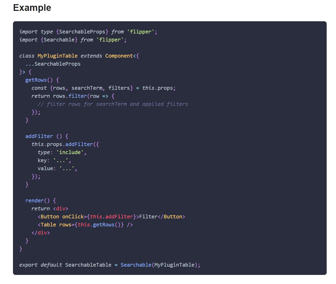
### Example
|
|
```tsx
|
|
import type {SearchableProps} from 'flipper';
|
|
import {Searchable} from 'flipper';
|
|
|
|
class MyPluginTable extends Component<{
|
|
...SearchableProps
|
|
}> {
|
|
getRows() {
|
|
const {rows, searchTerm, filters} = this.props;
|
|
return rows.filter(row => {
|
|
// filter rows for searchTerm and applied filters
|
|
});
|
|
}
|
|
|
|
addFilter () {
|
|
this.props.addFilter({
|
|
type: 'include',
|
|
key: '...',
|
|
value: '...',
|
|
});
|
|
}
|
|
|
|
render() {
|
|
return <div>
|
|
<Button onClick={this.addFilter}>Filter</Button>
|
|
<Table rows={this.getRows()} />
|
|
</div>
|
|
}
|
|
}
|
|
|
|
export default SearchableTable = Searchable(MyPluginTable);
|
|
```
|